indikitch murals

More than a decade ago, we were commissioned by a new client to develop a fast-casual Indian restaurant concept, from its inception.  The client's prior experience had been in manufacturing and distributing packaged Indian foods, and he was now looking to branch out into the restaurant industry, modeling the brand after concepts like Chipotle and Qdoba.  Having developed one other quick-service concept to that point, we understood that the approach to be taken for this type of venue would need to be very different than that of a full service restaurant, for many reasons, and in many ways.  A main differential is the importance of the brand's image, from the name, to the logo, marketing attitude, and all elements of the store design itself.  A successful approach is a wholistic one, where everything that the customer will encounter leads them back to a center point.  In blogs to follow, we will explain more our involvement in naming the concept, developing the logo, our experience in the brand's marketing, as well as the actual store design.  Here, we will focus on one aspect of the design, the murals.  

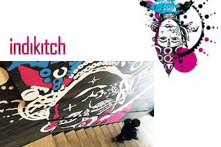
With this particular brand, we felt that it was important to detach from any potential stereotypes that could be assigned to the brand, prematurely.  There are known associations that even our client recognized, that could create an unapproachable vibe for the Western audience, if we were to utilize some of the more commonly seen and used elements of what makes something "Indian".  The client had some ideas prior to our involvement, and even some name choices, but we wanted to strip it all down, and start from scratch.  We did a considerable amount of research into the culture, most of it visual, to be able to create a relatively simple store design, while capturing some sense of what would indicate to customers that this would be an authentic Indian experience.  One of the ways that we expressed the culture was through a series of custom designed murals, inspired by some of the images we had encountered during our research.  Below, you'll see some of those inspirational images, as well as our initial sketches, and a few of the murals that were ultimately installed into various locations.  We created these murals both by hand and computer, and sent them to an artist, who would then project our art onto the walls, and hand paint them - some of which spanned 2 stories in height.  As you'll see, the look of the murals evolved, as did the design of the stores.  


mural sketch

mural sketch

mural sketch

first installed mural


last mural installed

Creative Restaurant Design NYC, Restaurant Interior Design NYC, Interior Design Manhattan, Miami Restaurant Consulting, Hospitality Design New Jersey, Restaurant designers NYC, Restaurant designers NJ, Restaurant designers CT, Restaurant designer PA, Restaurant design NYC, Restaurant design NJ, Restaurant design CT, Restaurant design PA, Residential Design, Restaurant design company, Restaurant Architects, Restaurant architecture, Restaurant branding, Restaurant identity

What a Project, the end


As the project progressed, we moved from the Architect's office, to an on-site trailer for weekly meetings.  We endured extreme cold and extreme heat, as the seasons passed.  The collaboration between myself and every tradesperson involved during these meetings, and the client, was beyond anything I had experienced in the past, with all of us working to achieve the best possible with whatever element we were tackling at that very moment.  You say you want to carve the master tub out of a single chunk of marble?  Let's see what we have to do to make that happen in terms of sourcing the stone, finding the person and tools that can create such a thing (in India), shipping it here, supporting its weight in place, and installing it.  Yes, we did it for the tub, along with many other seemingly unattainable items, such as the dining table made much in the same way as the tub, as well as the bar in the music room, a fireplace surround, and the main kitchen island.  

Prior to my involvement in this project, I was a designer who would arrive at my decisions in a very singular way, sometimes in collaboration with my partner.  I would attend meetings with preset notions that I would hold to strongly, for fear that outside influence could possibly dilute the idea, and weaken the end result.  The experience here, because it was a private home and not a restaurant project, invited me to both consider ideas coming from the outside, and open my own up for discussion at the table.  Every element of the home was custom or customized, so it did require an enormous amount of involvement from everyone.  From the HVAC contractor customizing the exterior vent covers for minimal visibility on each of the various materials, to the plumber who was tasked with creating a central water feature within a custom granite enclosure, and everything in between, it all required patience, understanding, determination, and know-how, to achieve mostly what I had envisioned, more than anyone else on the project.  The client did some heavy lifting himself, designing and directing the fabrication of a few of the more traditional elements, like a limestone screen and female figure which sat in front of the main bedroom water feature, the carved teak dining ceiling, and the brass bells hanging in the central "chowk".  With those items, it was my job to offer detailed input and direction, and incorporate each in the best way possible, within the overall aesthetic.  

The commitment that everyone displayed throughout the 7 year process impressed me, as we all worked together to achieve the best end result possible, despite any and all challenges that came up along the way, and there were more than one could count.  Needless to say, this was an amazing opportunity that left an indelible mark on me, personally.  I am a better designer in all ways, having had this type of collaborative and immersive experience with such a great group of individuals.  My level of gratitude to this client for entrusting us with such a weighty task is only matched by that of my relief, knowing how happy the family is living there every day.  What a project.

carved marble tub coved into marble floor tiles

marble dining table & carved teak ceiling

marble fireplace surround


marble & granite island

screen & central water feature in traditional "chowk" area

chowk left, limestone screen & figure right

Creative Restaurant Design NYC, Restaurant Interior Design NYC, Interior Design Manhattan, Miami Restaurant Consulting, Hospitality Design New Jersey, Restaurant designers NYC, Restaurant designers NJ, Restaurant designers CT, Restaurant designer PA, Restaurant design NYC, Restaurant design NJ, Restaurant design CT, Restaurant design PA, Residential Design, Restaurant design company, Restaurant Architects, Restaurant architecture

What a Project, ct'd

Our client had developed his floorplans with thoughtful intent, to capture every culturally important and functional requirement that he and his family needed and wanted.  So as we continued with the design process, we took these floorplans as they were, and began elevating each of the countless walls.  Through meetings with our Architect, we established maximum ceiling heights based on the total building height allowed by the Township.  We maxed out the height, and ultimately the footprint, down to the thickness of the stone that we were able to use on the exterior.  It was an intense and very meticulous exercise.  

The house sits at the top of a hill, with an endless view of wavy farm and forestland below.  It was a main goal of our client to see as much of this as possible, from the interior.  Large picture windows with minimal-to-no frames were incorporated into the design, as were walls of glass in several locations.  

We were given a very long leash when it came to design.  And, as we had experienced with the restaurants we had designed for him, our client had access to artisans of all trades in India, so whatever we would dream up, he could execute.  This was both a thrill, and a tremendous burden.  The responsibility that I personally felt as the lead on the project was unlike any other I had experienced in my career.  That feeling stayed with me until about a year after the project was completed.  It would ultimately be a seven year process, very unlike the typical race to the finish restaurant project.

We established an overall color, finish and materials scheme rather quickly.  The intention was to maintain a limited palette of materials, with almost all matte finishes throughout.  The walls were meant to be as smooth as possible, with a very matte finish, and no texture at all.  Almost dusty looking.  Dull finished teak was the go-to wood for the upper floor as well as the custom millwork and stairs throughout.  The stones used were honed and flamed black granite, honed limestone, and Lilac marble.  Blackened steel and dark bronze were used, along with blackened/burnt oak, sparingly.  

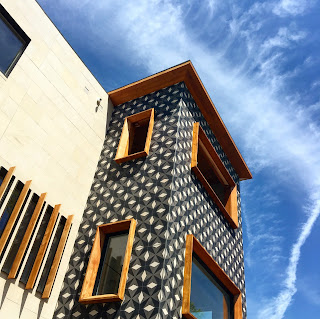
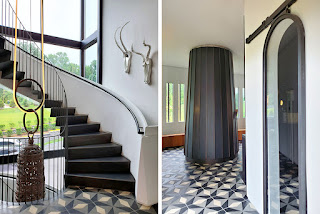
The overall sweep of the interior would remain relatively simple, as a main goal for me was to make this 18K SF building feel humble.  Yet, there was occasion for selective details, pulled from the back of our minds as we thought of what we had seen while researching India for the restaurants, years prior.  We took the bold decision to cover the main level floor in a star pattern of black granite and white limestone, which would then carry onto certain portions of the exterior of the house.  Continuity was another main objective.  Doors throughout were made of teak, each designed with a different number of half-sphere inclusions placed vertically in their center.  General lighting was also minimal, where the wall sconces were actually inverted into the wall, with no visible source of light, and no protrusion.  Ceiling lights were frameless, and continuous whenever possible.  Some examples from the house:

patterned stone main floor

patterned stone exterior & teak window frames
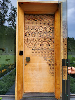
carved teak entrance door

teak doors with inclusions & teak stair w/ recessed handrail

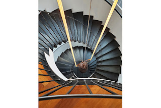
blackened steel cantilevered stair & pizza oven
custom limestone wall tiles

blackened steel stair
Creative Restaurant Design NYC, Restaurant Interior Design NYC, Interior Design Manhattan, Miami Restaurant Consulting, Hospitality Design New Jersey, Restaurant designers NYC, Restaurant designers NJ, Restaurant designers CT, Restaurant designer PA, Restaurant design NYC, Restaurant design NJ, Restaurant design CT, Restaurant design PA, Residential Design

What a Project

In 2012, we were approached by a client of ours, asking if we would design his private home.  At the time, we had completed a few quick service restaurants for him, and were just starting to design his corporate headquarters.  Although we had been focused mainly on hospitality design projects up until that point, he said that he liked our style and that we understood him well, so had confidence in our ability to deliver.  We would soon find out that it wasn't just any home, it was going to be an 18K SF, ground up, 100% custom build-out.  In reality, one could argue that there are blurred lines between hospitality and residential design, especially with a home of this size, and with an open-minded client.

He had started to conceptualize the design, and provided us with a hand sketch of the exterior as he saw it, as well as floorplans of the main level, upper level, basement and sub-basement.  It would include 6 bedroom suites, 3 kitchens, a theater, and several living spaces including a space called a "chowk", which would become the central point of the home.   

I imagined the look of the home to be very different than what the client presented to us, and redesigned the exterior in its entirety.  Upon presenting it to him, he remarked that I had changed it so much that he didn't know how to comment about it, and found no way to criticize it.  So, from there, we began in earnest, in the direction that I had set.  

His was a traditional Indian family, and the restaurants that we had designed for him were Indian as well.  But when we were commissioned to conceptualize the restaurants from inception, we took to the library to educate ourselves on the culture, from its depths.  This allowed us to free ourselves from any pretenses that one might have when imagining what "Indian" might look like, and enabled us to play off of certain characteristics that left a mark on us during our research.  Having this background within us served us well as we developed the overall look and feel of his home.  It would be our interpretation of what we had seen, modernized and filtered, but still, somehow, unmistakably Indian.

Next post, I will get into more details of how the project progressed.  Here are a few photos of the final outcome...


Creative Restaurant Design NYC, Restaurant Interior Design NYC, Interior Design Manhattan, Miami Restaurant Consulting, Hospitality Design New Jersey, Restaurant designers NYC, Restaurant designers NJ, Restaurant designers CT, Restaurant designer PA, Restaurant design NYC, Restaurant design NJ, Restaurant design CT, Restaurant design PA, Residential Design

Roman & Williams

We take walks around NYC on most weekends, and one of the places we find ourselves gravitating towards is the area of Howard Street, in Soho. There you will find interesting shops like Rick Owens, Roll and Hill, BDDW, and The Guild, with La Mercerie. I personally never tire of wandering through The Guild, once through the bustling brunch crowd at the front. When we initially stumbled upon the private room in the basement, we were charmed by it and the curated objects and books surrounding it.  That is certainly a place to be for any special occasion. Roman and Williams has a tremendous ability to create cravable spaces. We first noticed them when the redesigned the iconic Royalton here in NYC. They took an approach that was foreign to us, it was moody, and dark, and mostly brown with blue. We weren't sure if we liked it, but it sparked a trajectory for them that cannot be denied, and now, we are fans. They have mastered the art of capturing that subliminal it factor, which people seek, even before social media starts beating the drum.  The restaurant industry, especially in NY, is brutal.  It is beyond competitive, people are watching, and when you manage to not only be open but to be thriving after 7 years, you surely have done and continue to do the right thing.  

It seems that we just can't get enough of certain places, mostly restaurants but sometimes shops, as we naturally absorb what makes NYC such a great scene. We have seen quite a bit here and around the world; complex and non-complex, under-designed as well as over. But it always boils down to striking the perfect balance that pleases and end user, while remaining true to itself. Many times it's in the details, layers upon layers of the right elements, resulting in a sum greater than its parts. Roman and Williams delivers that way. As an example, the tarps over the dining sheds outside of La Mercerie are tied onto tiny porcelain insulators, apropo to the history of the place where they sit, traveling along the top of its sides. This specific detail would probably go overlooked by almost everyone, who wouldn't know what that is anyway. But for us, it shows an ability and an attention to details that not many follow through with. Budgets and willing clients help in that achievement, no doubt, but they have earned their place at that table. 

The area around Howard Street is undeniably special. Similar to the rest of Soho, the old NY architecture is amazing of course, but these specific few blocks are less traveled, tucked in, and feel like a secret. Last weekend my closing remark as we were leaving was, regardless of what we may have seen, it's always inspiring to be down here.  


Creative Restaurant Design NYC, Restaurant Interior Design NYC, Interior Design Manhattan, Miami Restaurant Consulting, Hospitality Design New Jersey, Restaurant designers NYC, Restaurant designers NJ, Restaurant designers CT, Restaurant designer PA, Restaurant design NYC, Restaurant design NJ, Restaurant design CT, Restaurant design PA

Mixed Use

Over the past 2-3 years, there has been a noticeable uptick in the amount of "mixed use" shops you may run into walking around NYC.  Maybe 10 years ago, Club Monaco Flatiron was the first such place that we noticed, which housed a flower shop sitting in a room displaying books for sale, connected to a coffee shop, all belonging to their original, clothing store.  All types could be seen there mid-day, browsing the books, admiring the flowers, and ultimately, chatting while sipping a coffee.  Maybe one day they would buy a sweater.

I've written previously about the crossover at the Public Hotel, where Ian Schrager has clearly established a go-to spot for just about anything - stay, work, play, eat...  But these smaller street level shops are beginning to morph as well, to capture one's attention with one of their many offerings.  They're creating a buzz, exuding a certain lifestyle, in the hopes that they will develop a devout following of people who like what they're putting out there for one reason or another.  These companies are paying attention to their store design, graphic design and branding, and of course, social media.  Cafe Kitsune and Aime Leon Dore are two notable examples of this trend.  Aime Leon Dore, created in 2014, this year gained a partner in LVMH.  Pretty impressive for a little LES shop.  It caught or attention about a year ago, as we had to find our way through a lingering crowd spilling out from their doors onto Mulberry Street in front of their pretty white storefront.  At that time, we had no idea who they were or what they were doing.  Once we were finally able to peer in, we saw that they were mostly a streetwear store, with of course, a hip coffee shop imbedded inside.  It was a see and be seen type of vibe.  

As designers, we are glad that brands like this are becoming a bit more savvy with their visual presence, after about a decade of lesser calculated, piecemeal approaches taken by many who wanted to invest much less time, money and effort, to open a place.  People are stepping it up, and we are here for it.  

Aime Leon Dore

Cafe Kitsune

Creative Restaurant Design NYC, Restaurant Interior Design NYC, Interior Design Manhattan, Miami Restaurant Consulting, Hospitality Design New Jersey, Restaurant designers NYC, Restaurant designers NJ, Restaurant designers CT, Restaurant designer PA, Restaurant design NYC, Restaurant design NJ, Restaurant design CT, Restaurant design PA

Extra Virgin

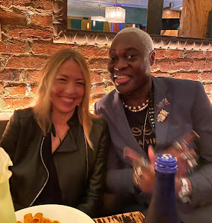
Having lived in the West Village for the past 12 years, we have studied most of the local restaurants, many having come and gone.  All things considered, for the past 8 years, our preferable go-to spot has been Extra Virgin on West 4th Street.  Why EV?  Other than the beloved manager, Jean Rene (who is a born natural) we are most at home, outside of our home, here. 

More than any other time, the last 2 years have impressed upon us the importance of community, beyond what we had understood that to mean before, and the role a restaurant like EV has played, within it.  We chose to live in the WV because of the unmistakable neighborhood feel it possesses, far more than any other area of the city.  And when we felt that this ‘town within a city’ that we had enjoyed daily, that we crave when we’re not there, could possibly wither away, we started to appreciate it even more.  We became closer to people like Jean Rene during this time, and he to us, as I think everyone was feeling that they wanted to cling to what we all had.  

But what is it about EV?  Consistency in the quality of our preferred menu items has been relatively good, which is a key component in maintaining regular customers.  But what we have come to appreciate most is the atmosphere, created by the other regular customers that EV draws.  There is a certain ease that regulars bring with them, that translates into a relaxed environment filled with the right energy.  That type of vibe cannot be created only with food, nor design, nor the music.  In fact, this restaurant in particular is nothing to write home about when it comes to design, and actually bucking the tradition of good restaurant design, the only decided color in the place is green.  Music wise, they typically choose a lane and stay there; one night could be hip hop, another rock, Latin….  you never know what you’re going to get.  But that home away from home feeling cannot be denied here, for us.  In all of these years, not one other has come close to EV.

We have been restaurant designers in the NYC metro area for decades, and we understand very well what makes a restaurant successful (as well as the adverse).  Efforts are made across the board in an ever changing market to try to achieve that sweet spot of a very complex curve.  Not one thing secures your success just as one other won’t bring you to fail, but it is the cumulative effect of positive points that results in “I will be back” said to your partner or yourself, and if you’re a regular, it’s only a question of when.


Jean Rene

Creative Restaurant Design NYC, Restaurant Interior Design NYC, Interior Design Manhattan, Miami Restaurant Consulting, Hospitality Design New Jersey, Restaurant designers NYC, Restaurant designers NJ, Restaurant designers CT, Restaurant designer PA, Restaurant design NYC, Restaurant design NJ, Restaurant design CT, Restaurant design PA